Papacream X Rhea Kapoor: Life’s guilty pleasures!

Client:
Papacream X Rhea Kapoor
Industry:
F&B, Ice Cream
Soft on the inside!
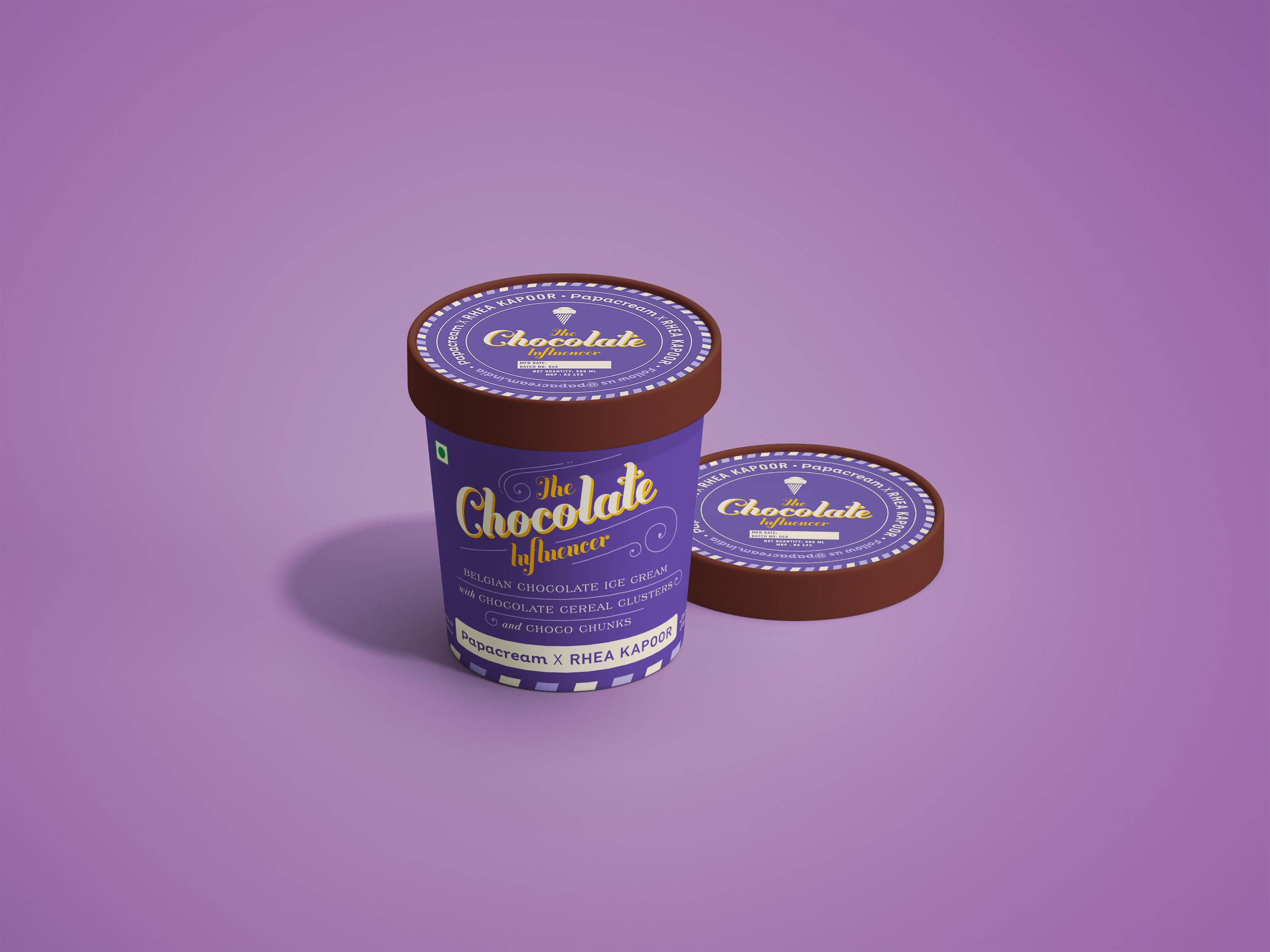
Nostalgia, pleasure and temptation — This is what Papacream aimed to achieve with the launch of their limited edition collaboration with Rhea Kapoor.
Each of the four flavours is reminiscent of growing up in 1990s India — from the classic milk chocolate to the evergreen cold coffee.
Taking inspiration from typographical systems, typefaces, colours and styles often seen on vintage packaging solutions, HeyHo adapted a unique and playful type design for each of the four flavours. Each tub plays around with the layered system of lettering. The use of different typefaces and type sizes makes each label design intuitive and striking.
The tubs together strike a perfect balance between novelty and symmetry. Each tub is distinctive, yet a part of the packaging system as a whole. The vibrant and bold colour palettes further accentuate the vivid and stimulating design.


Never guilty of my pleasure!
#cometopapa


